
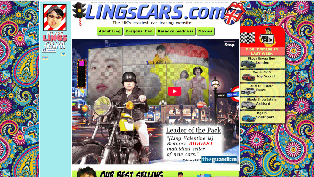
When you first visit LINGsCARS.com, you’re hit with a sensory overload. Widely considered the ugliest website on the internet, it’s a wild mashup of clashing colors, blinking banners, chaotic fonts, and auto-playing sounds. Imagine a GeoCities fever dream colliding with a neon-lit car dealership—and you’re getting close.
Here’s what you’ll see on the homepage:
- Comic Sans font alongside multiple other fonts
- Flashing text that rivals Times Square
- A burst of colors that would impress any peacock
- Random images of cats, dogs, and even a nuclear missile
The site uses bold yellow text on a bright pink background to grab your attention, while cartoon characters dance through what seems to be a list of car leasing prices. Amidst all the chaos, business is being conducted – but first, you’ll have to navigate through karaoke videos and animated employee avatars.
You might think there’s something wrong with your browser or that you’ve gone back in time to 1998. But no – this is just another day at Ling’s Cars, where every element on the page seems determined to catch your eye like an overly energetic child at a birthday party.
Trying to look away? You won’t. The ugliest website title isn’t just a jab—it’s part of the charm. It’s like watching a digital fireworks display put together by someone who found every color and animation possible and said, “Yes, all of them.” This is the internet’s most notorious car leasing site, where modern web design goes to die… and somehow thrives.
It’s So Bad… It’s Genius?
Behind the seizure-inducing visuals lies a brilliant marketing mastermind. Ling Valentine didn’t just create an ugly website—she weaponized bad design into a viral sensation that’s generated millions in car leases.
“I refuse to dumb down my site to patronizing corporate blandness,” Valentine declares in her signature bold red Comic Sans. This isn’t amateur hour—it’s calculated chaos.
The strategy? Stand out in a sea of sleek, minimalist corporate websites by going maximally bonkers. While other car dealers showcase gleaming vehicles on white backgrounds, Ling’s Cars assaults visitors with:
- Dancing cats in nuclear fallout gear
- Flashing Chinese pop music videos
- A real-time nuclear missile tracker
- Employee karaoke sessions
- Animated GIFs that would make MySpace blush
The results speak volumes: £106 million in car leases in 2015 alone. Turns out breaking every rule in the web design handbook can pay off spectacularly.
Valentine sees her site as a rebellion against modern web aesthetics. “Corporate minimalism is killing creativity,” she argues. “My site is what the internet could have been without greed-driven design standards.“
The genius lies in how the intentionally awful design becomes a trust signal. If someone puts this much effort into making their site memorably bizarre, they’re probably not trying to scam you. The chaotic energy translates into authentic personality—a rare commodity in the corporate world.
Think of it as anti-design design, where breaking all the rules becomes its own form of artistry. Ling Valentine isn’t just selling cars; she’s selling an experience that burns itself into your retinas and refuses to leave.
UX Designers, Please Look Away
Here are some design mistakes that would make any UX professional cringe:
- Color Chaos: Bright yellow backgrounds clash with hot pink text. It looks like the color values were chosen randomly.
- Font Fiesta: Comic Sans, Times New Roman, and Papyrus all in one place? This website has way too many fonts.
- Animation Overload: Dancing GIFs, spinning logos, and blinking text from 1998. The homepage is more animated than a dance-off.
- Navigation Nightmare: The menu structure is as confusing as an M.C. Escher painting. Good luck finding that car lease agreement!
- Content Density: No white space here! The site crams in more content than a conspiracy theorist’s bulletin board.
Remember GeoCities? That magical place where scrolling text tags were everywhere and every page had an “Under Construction” GIF? Ling’s Cars feels like GeoCities never went away – it just evolved into something even weirder.
The site breaks all the important rules from the Don’t Make Me Think book:
“Make important elements obvious”? Nope. “Establish visual hierarchy“? Not a chance. “Maintain consistency”? laughs in HTML
Modern UX designers preach the importance of simplicity, white space, and easy navigation. But Ling’s Cars is doing its own thing, wearing a colorful coat made of blinking tags and animated cursor trails. It’s proving that sometimes the best way to stand out is by breaking all the rules in a big way.
It’s Been Updated. Constantly. For Years.
Think Ling’s Cars is just some forgotten relic of the early internet? Think again. This digital masterpiece of mayhem isn’t collecting dust—it’s evolving faster than your iPhone’s iOS updates.
The site currently rocks version 238.20160215 (try saying that five times fast), with a whopping 4,000 lines of source code. That’s more complex than Apple.com, which probably says something profound about minimalism versus maximalism, but we’re too distracted by the dancing nuclear missiles to figure out what.
Ling Valentine treats her website like a living, breathing digital pet. She’s spent 15+ years feeding it new features, animations, and the occasional nuclear missile GIF. While other businesses push out cookie-cutter redesigns every few years, Ling’s Cars gets fresh updates with the regularity of a caffeinated coder on a deadline.
Some recent additions to this digital carnival include:
- A virtual office tour featuring Ling’s actual nuclear missile truck
- Karaoke videos of Chinese pop songs (performed by staff)
- Video FAQs starring a flight attendant drinking Jack Daniel’s
- An ever-expanding collection of animated cats and dogs
- Interactive games that somehow relate to car leasing
The site’s changelog reads like a diary of digital chaos—each entry marking another deliberate step away from conventional web design wisdom. Every update seems to ask: “How many more elements can we cram onto this page before the internet breaks?”
Between the nuclear missiles and dancing cats, Ling has built something rare in today’s web landscape: a site that refuses to grow up, settle down, or tone it down. And judging by the £106 million worth of cars leased in 2015 alone, this strategy of constant chaos is working brilliantly.
Why It Endures (and What It Says About the Web)
Let’s face it – Ling’s Cars shouldn’t work. It breaks every rule in the modern web design playbook. Yet here we are, still talking about a website that looks like it was designed by a caffeinated raccoon with access to Microsoft FrontPage ’98.
The secret? It’s real. In an era of cookie-cutter corporate websites and AI-generated content, Ling’s Cars screams authenticity through its nuclear explosion of GIFs and Comic Sans. It’s the digital equivalent of that eccentric aunt who wears mismatched neon socks and tells the best stories at family gatherings.
Consider these elements that make the site an enduring internet legend:
- Pure, unfiltered personality: Every flashing banner and bizarre animation reflects Ling Valentine’s actual character
- Anti-corporate rebellion: The site’s chaos is a deliberate middle finger to sanitized, corporate web design
- Memorable user experience: You might hate it or love it, but you’ll never forget it
- Proof of success: £106 million in car leases proves that “good design” isn’t everything
The endurance of Ling’s Cars teaches us something fascinating about the web: users crave authenticity more than they demand perfection. While UX designers chase the latest minimalist trends, this digital fever dream reminds us that websites can be messy, weird, and human.
Ling’s Cars isn’t just the ugliest website—it’s a living time capsule from a wilder internet era. In a world shaped by sleek templates and UX rules, this site breaks every convention and still wins. It’s a technicolor reminder that personality beats perfection, and sometimes, ugly gets the job done.