
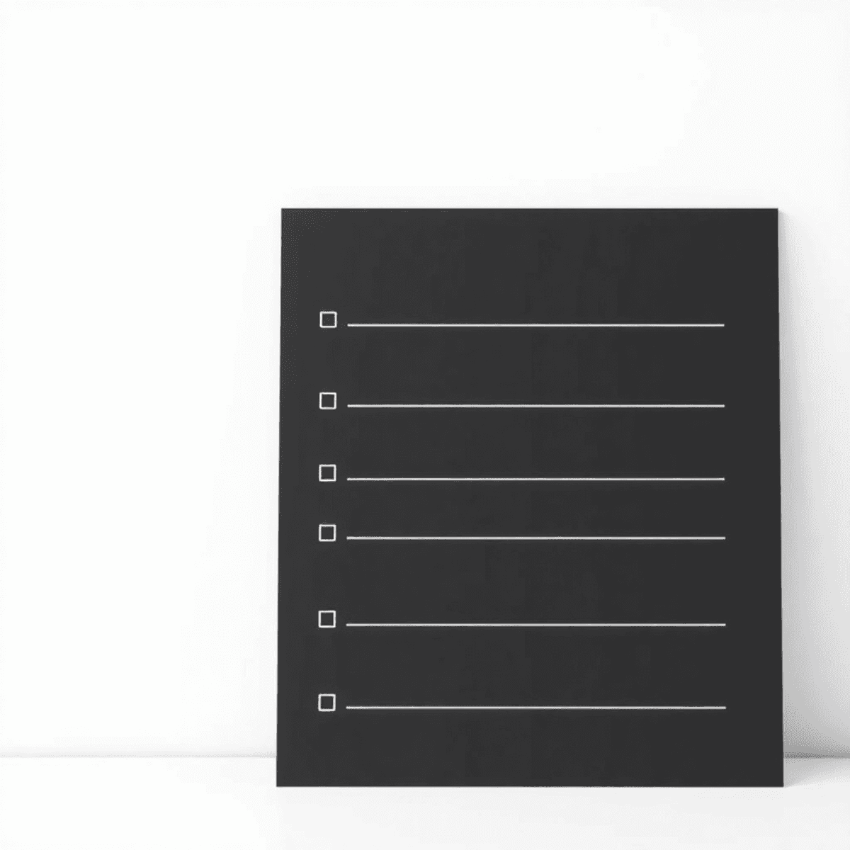
Imagine a minimalist to-do list app that’s so simple, it doesn’t even have buttons. No menus, no cluttered interface—just pure, focused productivity at your fingertips. Welcome to Simple List.
In a digital world filled with feature-packed productivity tools, ultra-minimalist to-do list apps are becoming a refreshing change. These apps challenge the idea that more features mean better productivity. Instead, they embrace extreme simplicity in design and function.
Think of it as the zen garden of task management: clean, purposeful, and free from distractions. By removing traditional interface elements, these apps create a calm digital space where users can focus solely on their tasks.
The beauty lies in their simplicity:
- No complicated menus to navigate
- No endless customization options
- No notification overload
- Just you and your tasks, existing in perfect harmony
This approach to task management isn’t just about looking minimalistic – it’s a powerful statement about how we interact with our productivity tools and what we truly need to get things done.
The Rise of Ultra-Minimalist To-Do List Apps
The world of digital productivity has seen a significant change with the rise of ultra-minimalist to-do list apps. These apps are a complete departure from traditional task management tools, getting rid of unnecessary features to provide a simple and focused experience.
Core Principles of Minimalist Design in To-Do List Apps
The main principles behind the minimalist design of these apps include:
- Intentional white space – creating breathing room for tasks
- Limited color schemes – often just black and white
- Typography-focused interfaces – using font hierarchy instead of buttons
- Gesture-based interactions – swipes and taps replace clicking
Clean Interfaces: A Signature Feature
Clean interfaces have become the signature feature of these apps, avoiding common UI elements like buttons, dropdown menus, and toolbars. The outcome? A blank canvas where tasks can move freely, unhindered by visual distractions. This shift towards simplicity not only enhances usability but also boosts user engagement significantly.
The Role of Monochrome Aesthetic
The monochrome aesthetic is crucial in this minimalist movement. By restricting colors to black, white, and subtle grays, these apps create an atmosphere of tranquility and clarity. This intentional decision helps users concentrate on their tasks instead of being sidetracked by vibrant interface components.
A Shift in User Preferences
The emergence of these ultra-minimalist apps shows a growing demand for digital tools that respect our attention spans. Users are increasingly looking for apps that prioritize simplicity and intentional design, marking a significant change from the past when productivity solutions were packed with features.
Distraction-Free Task Management with Minimal UI Apps
A distraction-free planner strips away visual noise and unnecessary features, creating a focused environment for managing tasks. These apps embrace a “less is more” philosophy, allowing users to concentrate solely on their to-do lists without battling interface elements or notification overload.
How Minimal UI Apps Reduce Cognitive Load
Minimal UI apps reduce cognitive load through several key design choices:
- Single-focus screens: Each view serves one specific purpose
- Limited color palette: Often using just black, white, and one accent color
- Gesture-based interactions: Replacing buttons with intuitive swipes and taps
- Progressive disclosure: Showing additional options only when needed
The Benefits of Using Minimal UI Apps
The benefits of using minimal UI apps extend beyond aesthetic appeal:
- Reduced decision fatigue: Fewer choices mean quicker task entry and management
- Improved focus: Clean interfaces minimize the urge to fidget with settings or reorganize tasks
- Faster task processing: Simple gestures speed up task completion and list management
- Lower learning curve: Intuitive design requires minimal onboarding
These apps create a zen-like digital workspace where users can process their tasks without technological distractions. The minimal UI approach transforms task management from a complex system into a straightforward practice, similar to writing on a blank piece of paper.
Users report spending less time managing their task system and more time actually completing their work. The absence of traditional UI elements creates a direct connection between thought and action, making task management feel natural and effortless.
Functionality Over Features: The Case for Simple Task Managers
Simple task managers challenge the idea that more features mean better productivity. These apps get rid of unnecessary extras and focus on what really matters – the ability to create, complete, and manage tasks without any distractions.
Common Features That Create Complexity
A simple to-do app removes common features that often create unnecessary complexity:
- Notifications and Reminders: Instead of constant alerts, users choose when to engage with their tasks
- Complex Tagging Systems: Tasks exist in a single, focused list without elaborate categorization
- Priority Levels: The binary nature of task completion (done/not done) eliminates decision paralysis
- Due Dates: Users focus on what needs doing rather than arbitrary deadlines
How Minimalism Powers Productivity
The strength of these minimalist apps is in what they don’t have. By getting rid of things that aren’t necessary, they create an environment free from distractions where tasks become clear actions instead of items to be managed.
Think about how most people manage their tasks: they open an app, go through menus, set categories, add tags, set reminders, and choose priority levels. Simple task managers cut all that down to the basics: add task, complete task. This straightforward method fits perfectly with the main goal of productivity tools – actually getting things done.
Innovative Interactions in Design
Without traditional interface elements like buttons and dropdowns, designers are forced to come up with new ways for users to interact with their apps. Instead of tapping or clicking, they might use gestures like swiping or long pressing. For example:
- A swipe might mark a task as complete
- A long press could delete it
These actions are intuitive and feel natural, so users don’t need to spend time learning how to use the app.
Enhancing User Experience and Engagement in Ultra-Minimalist Apps
Ultra-minimalist apps are great at creating smooth, natural interactions through simple gestures. For example, a quick swipe to the right means a task is done, while swiping left sends it to the archive. These actions based on gestures feel like an extension of how we interact with physical objects, making the apps seem responsive and lively despite their basic designs.
The Magic Happens in the Details
The true magic lies in the finer details:
- Swipe Mechanics: Gentle haptic feedback confirms task completion
- Pinch Gestures: Zoom in/out of task lists effortlessly
- Long Press: Reveals additional context when needed
- Double Tap: Quick task prioritization
Transforming Apps into Smart Digital Assistants
With natural language input, these apps become intelligent digital helpers. Users can simply type phrases such as “buy groceries tomorrow at 3pm” or “call mom next Tuesday,” and the app will automatically understand and convert them into properly formatted tasks with specific dates and times. This conversational approach eliminates the need for multiple input fields or complicated date pickers.
Creating an Experience That Feels Powerful Yet Invisible
The combination of gesture controls and natural language processing results in an experience that feels both powerful and effortless. Users can focus entirely on their tasks without having to grapple with complex interfaces or search for specific buttons. The app seamlessly integrates into their thought process – they think of a task, express it naturally through speech or text, and manage it using instinctive gestures.
These design choices demonstrate a profound understanding of human behavior and cognitive patterns, enabling users to maintain their natural workflow while staying organized.
Digital Minimalism and Productivity Trends: A Broader Perspective
The rise of buttonless productivity apps reflects a cultural shift toward digital minimalism. This movement extends beyond task management into a lifestyle philosophy that questions our relationship with technology. Users increasingly seek tools that serve their needs without demanding attention or creating dependencies.
Research shows that the average person switches between apps 566 times per day – a behavior pattern that fragments focus and reduces productivity. Ultra-minimalist apps address this challenge by aligning with key principles of digital minimalism:
- Intentional Usage: Apps without buttons encourage mindful engagement by requiring deliberate actions
- Value-Based Selection: Each feature must justify its existence through clear user benefit
- Reduced Digital Clutter: Clean interfaces minimize mental overhead and decision fatigue
The appeal of buttonless productivity apps stems from their ability to create what psychologists call “flow states” – periods of deep, uninterrupted focus. These apps serve as digital sanctuaries where users can concentrate on their tasks without the constant pull of notifications, settings, or complex menu systems.
This minimalist approach resonates particularly with knowledge workers and creative professionals who recognize that productivity isn’t about managing more tasks but maintaining clearer mental spaces. The stripped-down interface acts as a visual reminder to focus on what matters: the tasks themselves.
Embracing Minimalism in Task Management: The Key Takeaway
Ultra-minimalist to-do list apps represent a radical shift in productivity tools. These buttonless wonders deliver three core benefits:
- Mental clarity: A clean interface reduces decision fatigue and keeps your mind focused on tasks rather than app features
- Faster task management: Gesture-based controls and natural language input speed up list creation and updates
- Reduced digital clutter: The absence of notifications, tags, and complex menus creates a calmer digital environment
Design simplicity isn’t just aesthetic – it’s a powerful productivity enhancer. When your task manager steps back, your ability to get things done steps forward. The stripped-down interface eliminates the paradox of choice, letting you channel energy into completing tasks rather than organizing them.
Ready to embrace digital minimalism? Start by identifying unnecessary features in your current task management system. Consider switching to a minimalist alternative that aligns with your productivity goals. The path to enhanced focus and efficiency might just lie in having less – much less – on your screen.
Like this article? Check our complete list of productivity tools that will make your life easier.